Let's start with the conclusion: a game thumbnail that gets clicked comes down to three things. One killer frame, big text, and strong contrast. It is not flashy effects or dense information but the simplicity of being readable at a glance even on a small screen that drives click-through. This article is organized so you can follow along in order: pick the scene, lay on the text, and boost the contrast.
The average YouTube click-through rate (CTR) is usually around 3-4%, with well-run channels at 5-7%. Game videos face fierce competition, so a single thumbnail can swing views by two or three times. That is why there are often times you need to spend more time on the thumbnail than the video itself.
Step 1: Extract one killer frame
90% of a thumbnail is decided by which frame you pick. Find the one moment in the whole video where emotion explodes the most: the instant an ace lands, the moment a decisive teamfight breaks out, the exact frame you pull off a clutch. An ordinary waiting scene or a menu screen is never a candidate.
When picking a frame, check three things: whether the subject (the character or a kill marker) is sharply captured in the center of the frame, whether it is blurry or smeared with motion blur, and whether the background is too busy. Even in the same scene, one or two frames of difference can change the impact a lot, so compare several frames.
- Prioritize moments where the result is visible, like the kill feed or scoreboard
- Frames where the character's gaze or gun barrel points inward toward the frame grab attention
- Pick simple scenes that hold only one event per frame
- Bright frames where light or effects burst are better than dark scenes
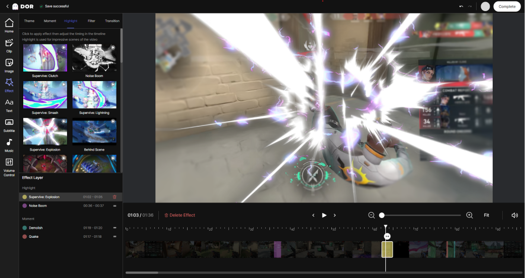
This is where DOR has a big advantage. With clips recorded in DOR, you can step through the timeline one frame at a time to find your killer frame and capture the moment you like straight to an image to use as thumbnail material. The key is pulling out killer frames at the original recording quality, with no need to launch a separate capture program or lose video quality.
Step 2: Lay on big text
Thumbnail text is a sign, not a sentence. The video title already handles the explanation, so 3-5 words is plenty for the thumbnail. Short, punchy lines like "1v5 Clutch," "No Way That Worked," or "Insane Ace" read far better than a long explanation.
Use a bold, angular typeface, and add a thick outline or shadow to the letters so they pop on any background. Make the text large enough to read at a glance even on a phone screen. Use the fact that most of your viewers actually watch on small mobile screens as your benchmark.
Tips for placing text
- Separate text and the face (or key object) left and right so they do not overlap
- Leave the bottom-right empty since the duration timestamp covers it
- Limit text to no more than two colors per thumbnail
- Keep the same font and position across your channel for brand consistency
Step 3: Boost contrast
Contrast is the last key that decides click-through. The more sharply the subject separates from the background, the more it sticks out even on a small screen. Just a bit of post-processing, like adding a bright outline around the character or laying a slightly darker background, makes the subject pop.
Color contrast matters too. Boosting complementary colors or light-dark differences, like a dark background behind bright text or a cool color next to a warm one, makes the thumbnail jump out within the feed. For a game with intense colors like Valorant, keep the effect colors as they are; for a game with busy teamfight screens like League of Legends, clean up the background to highlight only the subject. Adjust to fit the game.

Elements that push CTR even higher
Once you have the basic three down, you can raise click-through one more level with the following elements. The key is emotion and curiosity. Moments that show emotion, like surprise, excitement, or tension, produce far higher click-through than a blank expression. A layout that leaves behind curiosity, like "I want to know how this teamfight turns out," is also highly effective.
- Keep elements to three or fewer: average click-through drops once information exceeds four items
- Show a number or result: specific figures like 1v5 or 16-2 catch the eye
- Use an arrow or circle to emphasize just one key spot
- Use YouTube's Test & Compare to A/B test 2-3 thumbnails and choose by data
Wrap-up
For game clip thumbnails, just follow the order: pick one killer frame, lay on big text, and boost the contrast. The biggest difference ultimately comes down to which frame you use, so an environment where you can quickly pull out a good killer frame matters. If you capture killer frames straight from your DOR-recorded clips to use as thumbnail material, you can create an impactful frame at the original quality with no extra work.